Original Travel Posters, Reprints, Reissues & Reproductions
of a vintage travel poster?
Have a look at the following examples and don’t be confused in future.

No doubt, the first edition is definitely always an original vintage poster. On the one hand, reprints and reissues are collectible originals too. On the other hand, reproductions or retro-style posters may be very decorative for your home, but they are never valuable collectibles. If you are unsettled by different formats, learn more about different sizes of vintage posters.

Original Vintage Poster Printing Techniques
Early original vintage airline posters are usually lithographs in colors (from Greek lithos = stone and graphe = writing), a slow and expensive way to print. Usually the artist designed an original artwork on paper or canvas. This artwork had to be be transferred by a lithographer. This specialist had to draw the image reverse in a greasy substance and separated by colors on limestone plates.
"Lithography originally used an image drawn with oil, fat, or wax onto the surface of a smooth, level lithographic limestone plate. The stone was treated with a mixture of acid and gum arabic, etching the portions of the stone that were not protected by the grease-based image. When the stone was subsequently moistened, these etched areas retained water; an oil-based ink could then be applied and would be repelled by the water, sticking only to the original drawing. The ink would finally be transferred to a blank papersheet, producing a printed page. This traditional technique is still used in some fine art printmaking applications." Source: wikipedia
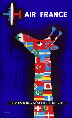
Lithographs in colors show very bold and bright colors. For instance, the extreme deep "Yves Klein Blue" at the background of Savignacs giraffe poster for Air France was realized by using this technique.
A very exclusive look was guaranteed by using metallic-gold spot color, extremely rare in vintage airline posters.

"Offset printing" vs. "Litho" confusion
A lot of confusion is caused by the word „lithography“. Traditionally it means limestone lithography. But this expression was transferred into the modern preprint production process for offset prints. The process of colorseparation (producing four rasterized printing plates for the cmyk offset prints, based on an artwork) is called „lithography“, too. Because of this you often find imprints like „Litho in U.S.A.“ on US posters.
In the late fourties the cheaper and faster offset printing process became common in the United States. Instead of printing a lot of different spot colors, it is possible to print the whole image with four colors only. You can detect the typical cmyk (Cyan - Magenta - Yellow - blacK) halftone dot matrix by using a magnifier.
The disadvantage of this technique is a loss of hue and brilliance of the image. Another problem is the low color fastness – after displayed in daylight for a few months the image is fading. Sometimes the artists combined offset printing and other techniques (e.g. silkscreen) for special effects.

Uncommon Printing Techniques
Exclusive advertising needs exclusive prints. In some European countries posters artists tried a lot of exclusive techniques.
Silkscreen (serigraphy) and linocut are some of these unusual and expensive printing techniques used for travel posters. The color is printed extremely bold on the paper, you can really feel it!
Silkscreen in combination with other techniques was often used to print the text for different languages on the image. In the late fifties, fluorescent ("day glow") colors hit the market and gave some modernist posters a shocking glare. Day glow colors could have been printed by means of offset print as so called "touch plate" (an additional color).
All these special features (and others like structured paper or varnished surface) you will never get by digitally printed reproductions!
Some artists made first experiments with black und white photographies, which were combined with colorful illustration.
A lot of difficult and complex techniques were developed by the aim to print fast and colorful like photographies.
For example: ”Heliogravure”, a kind of collotype. Photostyle posters printed with this luxurious technique don't show any dot matrix like offset prints, they
allow very smooth halftones. Learn more about collotye at getty.edu

Foreign Versions
To promote an airline or destination in foreign countries, it was necessary to print a poster in different languages.
The easiest way was to print a poster without text first. (Sometimes one of these pre-production posters you will find for sale. It is not the real thing for an earnest collector, because it is unfinished.) The different foreign text versions were often overprinted in black. Some designers preferred silkscreen technique, because that allows to print bright colors above darker images.
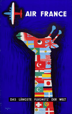
In case of lithographs in colors it was much more complicated. All foreign versions had to be produced for themselves. Please have a look at the detail pictures of the famous Air France poster by Savignac. Compare the flags! For each foreign version they had to be always illustrated again by the lithographers – and sometimes they made mistakes (do you find the differences?)

Reprint (Original Reprinted 2nd Edition)
Very often confused with reproduction (”reprint” is often colloquial used for ”reproduction”, thats a problem...)
Offset prints could be reprinted very easy, because the printing films or plates have been stored. Reprints (commissioned by the airline) are original vintage posters too, usually published one or two years after the first edition. In opposite to offset prints, lithographs in colors have never been reprinted. After the printing process the artwork was deleted from the surface of the limestone.
A common reason for reprinting a poster (with minor modification) was the change of the airline logo or introduction of a slogan.
For instance: In 1963 FCB (Foote, Cone & Belding – TWAs advertising agency from 1956 until 1968) created the well-known "Up, up and away" slogan. A lot of posters were reprinted by using the original colour-separations of the artwork, but an additional triangle with the new slogan appeared in the lower right corner.
Another reason for reprints was the introduction of modern jets. No airline wanted to display old style propliners anymore... For instance, in the late fifties United Air Lines decided to delete the DC-7 from Stan Gallis stunning Southern California poster. A third edition shows the headline "LOS ANGELES" in an italic typography.
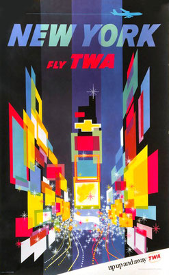
Especially some of Davis Kleins most sought after modernist TWA posters (New York, Las Vegas, Los Angeles, San Francisco) exist in two or more editions too.
The first edition shows a detailed illustration of a propliner, a Lockheed Super Constellation (New York, Las Vegas) or a Lockheed Starliner (Las Vegas 2nd Edition, Los Angeles).
The reprinted edition of these posters shows a silhouette of a Jet (Boeing 707).
The New York poster has been reprinted a third time (app. 1963), now with an additional triangle with the new "up up and away"-slogan in the lower right corner.
This stunning Pan American World Airways poster was published in different languages. The blue headline typography (here the french version: L'Amérique du Sud par Clipper) in the upper part was silkscreened. But it is against logic, because the company's name and the french(!) subline is part of the offset print.
Some years later the airline changed their name in Pan American. They cut off the lower part of the printing film and mounted a black area. So it was possible to overprint the new name of the company by silkscreen. The headline changed its color in yellow, because it was faster and cheaper instead of silkscreening a second spot color. Here you can see the spanish version (Sudamérica por Clipper).
This great illustration by Walter Bomar didn't need to be changed when American Airlines introduced the Lockheed L-188 Electra II. But was the ‘modernisation’ of the poster design as good as the technical innovation (the Electra was Americas first Turboprop) of the aircraft? You'll have to decide for yourself...

Reissue (Reedition)
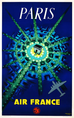
Some posters showing popular destinations were released by the airlines subsequent to their original dates. For instance, Air France – Paris (P. Baudouin) was originally released in 1947 and reissued in the 1950s (middle) and in 1962 (right).
In the 50s a new Air France Logotype was introduced, the poster was reissued at a first time.
The 2nd reissue shows a jet instead of a propeller plane and again a new redesigned Air France logotype, with a slogan below.
Have a look at the artwork of the reissue: is a bit different, but interesting and valuable too. It was not possible to use the original artwork of lithographs in colors again – in opposite to offset prints. After the printing process the artwork was deleted from the surface of the limestone and it was prepared for the next subject. Accordingly it was impossible to reprint a poster.
The same happened to SABENAs Belgian Congo poster – a lithograph in colors too. Marcel Cros illustrated the artwork again, because new planes (DC-6B and later DC-7C instead of the old unpressurised DC-4), a relaunched logo and a new slogan had been introduced.
Herbert Leupins stunning Swissair poster depicts a DC-4 above the alps and was published in 1949. It exists in a second version, too (with the additional subline "THE AIRLINE OF SWITZERLAND" below the boat).
In 1956 Swissair changed logotype and livery (the aircraft only had one red cheatline). Because of introducing the DC-7C Herbert Leupin had to illustrate the poster again. His signature is in the lower left corner now, instead of middle right.
Please have a look at the younger version (on the right) of this TWA London poster. You will detect a Super Constellation with wing tip tanks (instead of the shorter Conny) a relaunched TWA logotype and a new uniform.
The first edition of this TWA Switzerland poster shows a Lockheed Constellation, the second edition (on the right) depitcs a Super Constellation with wing tip tanks. A change in the headline typrography and the loss of the subline is remarkable, too.

Retro-style Posters and Illustrations
Some artists are really good illustrators, but they have never been commissioned by airlines to design posters for them...
Be careful: The posters in the left column are NOT original vintage airline posters.
They have never been published by an airline!
Kerne Erickson is a well known illustrator, who designed a lot of retro-style posters in the 1990s and later. So he has never been commissioned by airlines to design posters for them. Some of his airline travel posters are just imitations of existing artwork, combined with original vintage logotypes or fantasy logotypes.
A real vintage poster collector embarrasses himself with these posters!
The original illustration of the palmtrees in front of the old church was made by Bob Smith in the 1950s. It was published in exactly this poster design by TWA.
Frank Soltesz’s highly collectable TWA poster of a Constellation flying above Manhattan was imitated by Kerne Erickson, too.
Everybody is able to decide by himself if these examples are inspiration or imitation. To a vintage poster collectors mind this poster is a fake.
One more fantasy TWA airline poster by Kerne Erickson and the original TWA San Francisco poster published in the 1950s.
The new "old" poster is nice to see, but not really collectable.
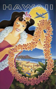
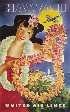
Another stolen idea of an original illustration. United Air Lines published the Hawaiian hula girl it in the 40s, famous Joseph Feher made the illustration.
Another fantasy TWA poster by Kerne Erickson, really a beautiful retro-style illustration, but not an original vintage poster.
Its template looks a bit poor, as far as I know this is not a poster but a small advertising.
A fantasy Pan American Airways poster (this PAA logo did never exist!) by Kerne Erickson an its template.
Nice to see, but to a vintage poster collectors mind it is a fake.
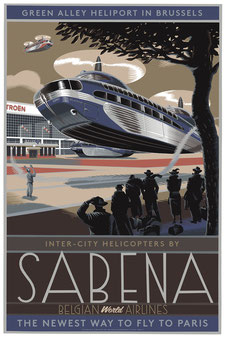
Laurent Durieux SABENA fantasy helicopter poster is a really stunning artwork. But: is was created more than 50 years after
SABENA was using helicopters on an international rotary-wing passenger service as a feeder service for it's fixed-wing international/European services. This service was started in September 1953 using the Sikorsky S.55 aircraft, which could carry eight passengers.
The Brussels illustrator Durieux was named one of the world’s 200 best illustrators by the influential international advertising magazine Lürzer’s Archive.
A company named AMERICAN AIRWAYS never existed! But: it was a common brand by a number of independent carriers. In 1933 they operated a transcontinental route network serving 72 cities, mostly in the northeastern, midwestern, and southwestern United States.
This Artworks, published in 1999 by Top Art Milano - Top Art LLC San Diego is a fantasy travel poster, inspired by an original TWA vintage poster, showing a view on Grand Canyon throughout the window of a Lockheed Constellation (identified by the round window).

Reproduction
On the other hand, a reproduction is simply a photographic copy (the original is scanned and printed) of the original poster. Usually reproductions are smaller than original vintage posters, but sometimes you will get large ones too.
A reproduction has little or no value as a collectible, but it could be expensive too. In case of high quality reproductions and lightfast prints you will get highly decorative art for your home. You can choose the size (common sizes are from 17 x 11" up to 36 x 24") and the quality of paper. The best choice for fine art digital prints ist called Giclée, prints on canvas are popular too.
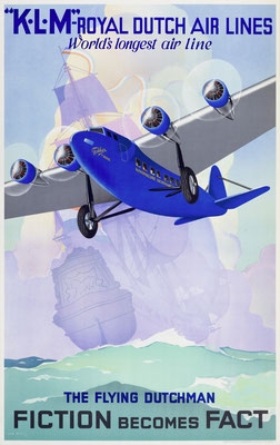
Be careful: Older reproductions are sometimes offered as "used" or "old" posters – don’t mix it up with vintage posters (e.g. years ago KLM and Air France posters have been reproduced in original size).
One warning is clear: If reproductions are offered as "second edition" or "reedition" this is nothing else than fraud!
Museum’s Edition
If a reproduction is made by museum, they call it ”museum’s edition”. They have usually original size (one sheet, app. 40 x 25") and look extremely similar to the original poster. Sometimes they are made by old printing techniques.
Most of them have an imprint which tells us that the poster is published by the museum.
Prints by Ré-Society
Ré Society says about their print, that "this is not print or reproduction. It is a remastered, recreated, original work of art."
And:
"This piece was produced at S2 Editions Atelier, New York City, in 1999, under the guidance of the Ré Society, Ltd, and S2 Art company. The lithograph is pulled through an 1800s French Marinoni Voirin press on Rives BFK archival paper. This lithograph bears the trademark of the Ré Society, plus the blind stamped emblem of the S2 Editions Atelier. The signature of the chromist is also printed unobtrusively on this lithograph in order to distinguish it from the original Golden Age poster. The lithograph is sequentially numbered in pencil in the lower left border, by a curator at S2 Editions."
So be careful if one of this posters is offered as "original lithograph in colors". It is true, that it is not a technical reproduction of the original print. It was recreated in 1999 with the intention to be very similar to the original.
BUT it is NOT the valuable original vintage poster printed in 1932.
Guide for Vintage Airline Poster Collectors
CLICK ON THE PLANES TO LEARN MORE
Tell your friends about Vintage Airline Posters - Original Airline Posters · Old Airline Posters · Antique Airline Posters

For translation of this website feel free to use Google translator


